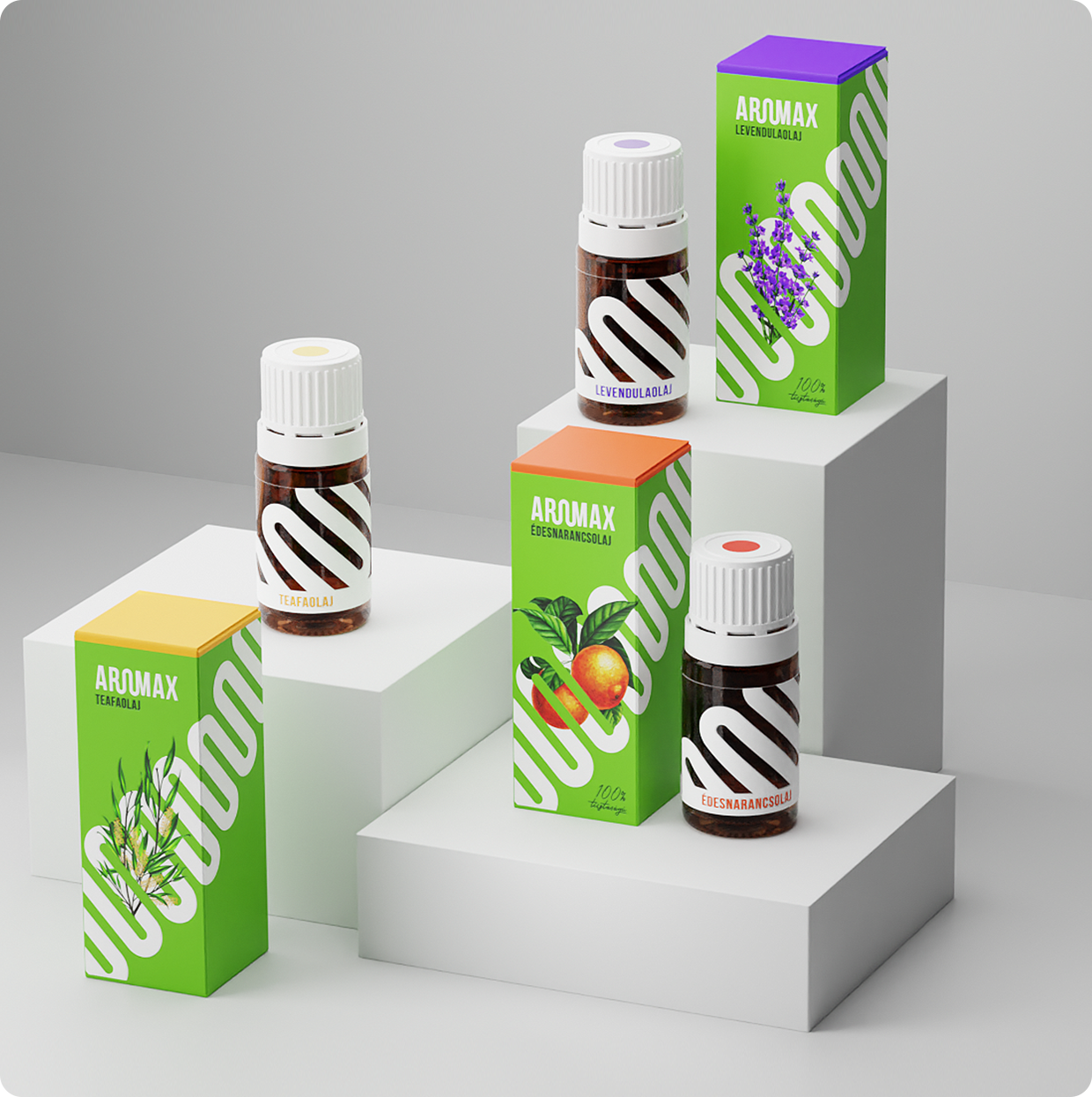
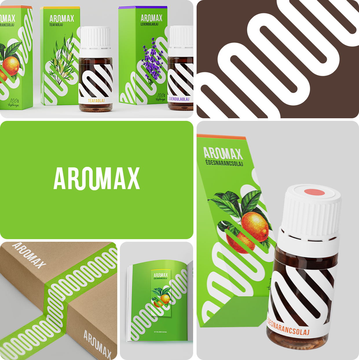
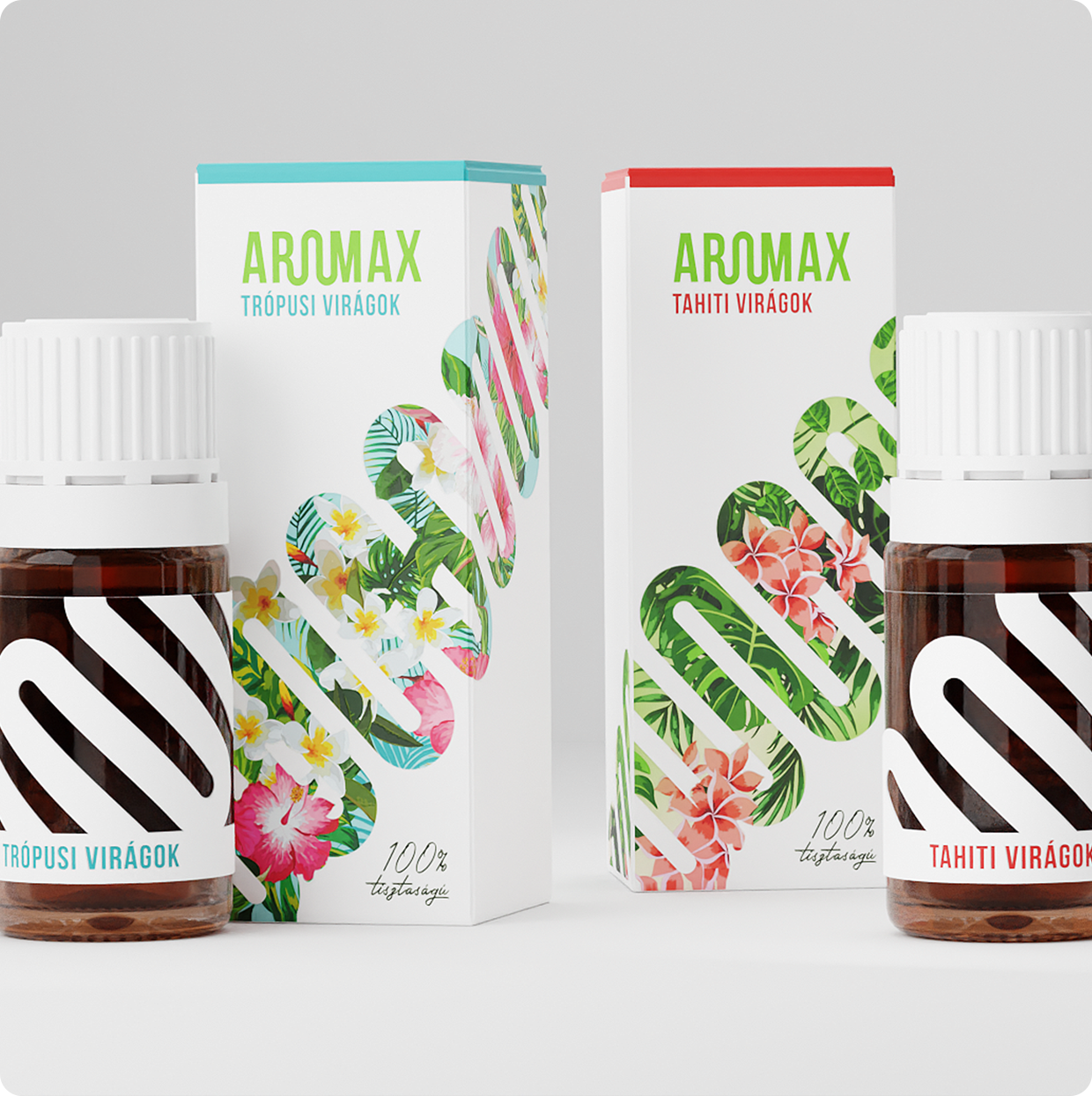
scents enhance the character of your home
rebranding
packaging
rejected
2019
this project is dear to me because it allowed me to design something bold and unique, differentiating it from other brands while ensuring consistency across the entire range of aromax products.
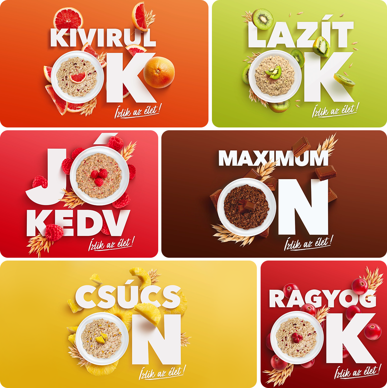
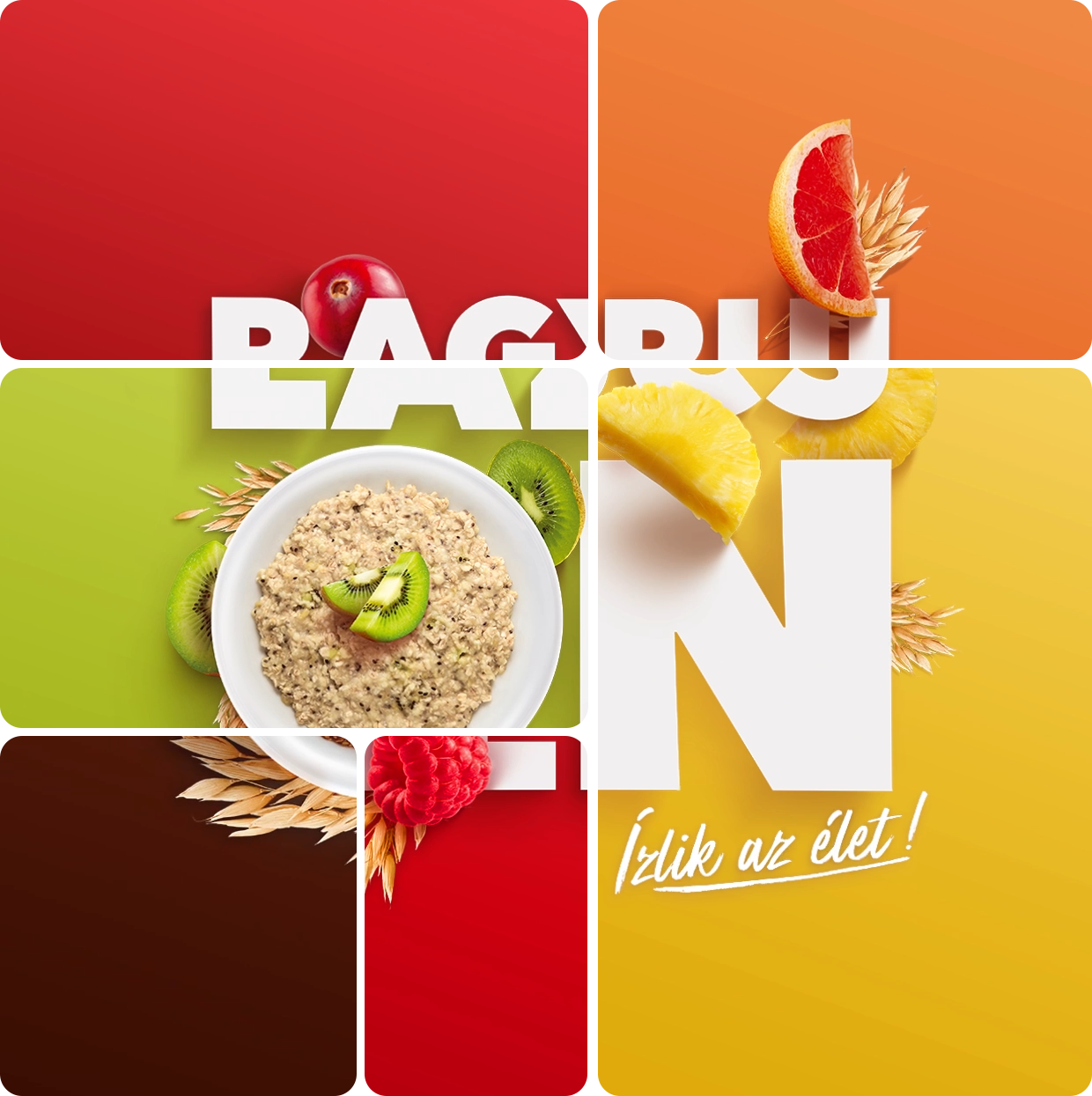
bon appetit for breakfast and playful letters!
advertising
key visual
art direction
2019
key visuals of the breakfast oatmeal product launch campaign, communicating the message through clever typography.
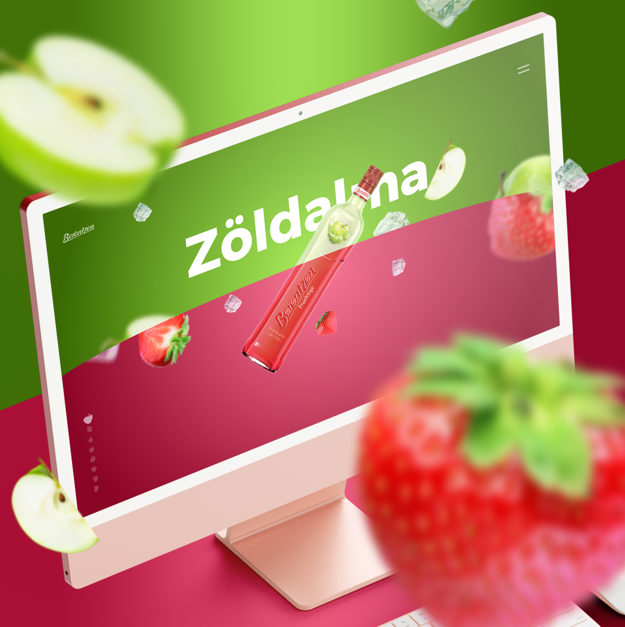
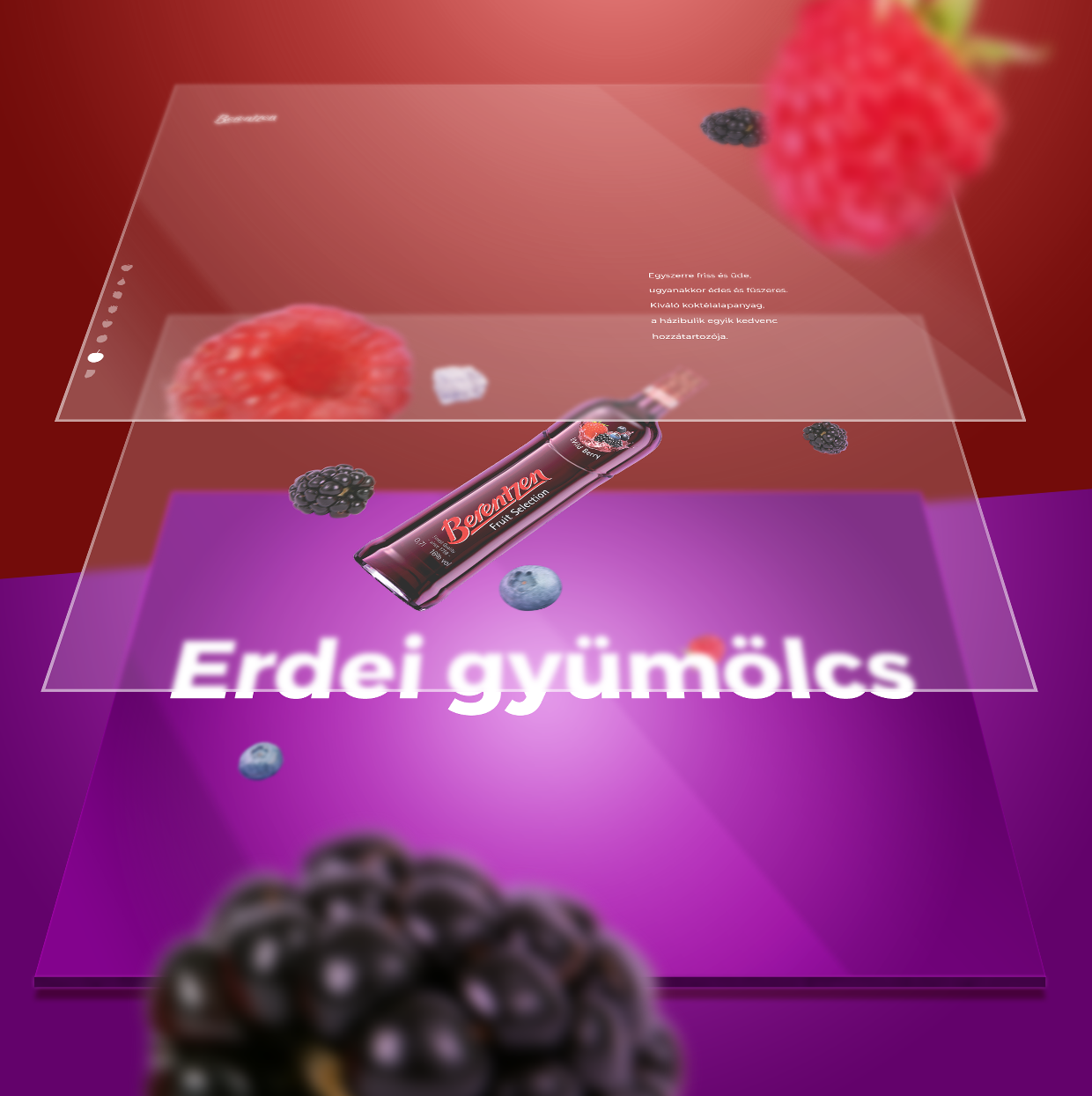
full of fruitful life feelings
webdesign
user experience
2016
with its range of fruity flavored beverages, berentzen liqueur aimed to elevate brand awareness among young adults in hungary.
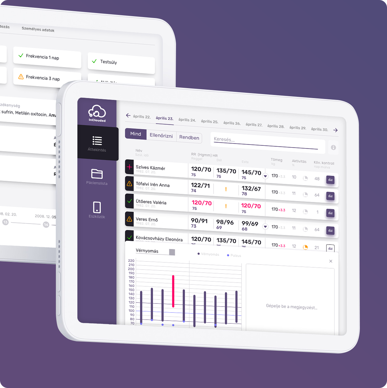
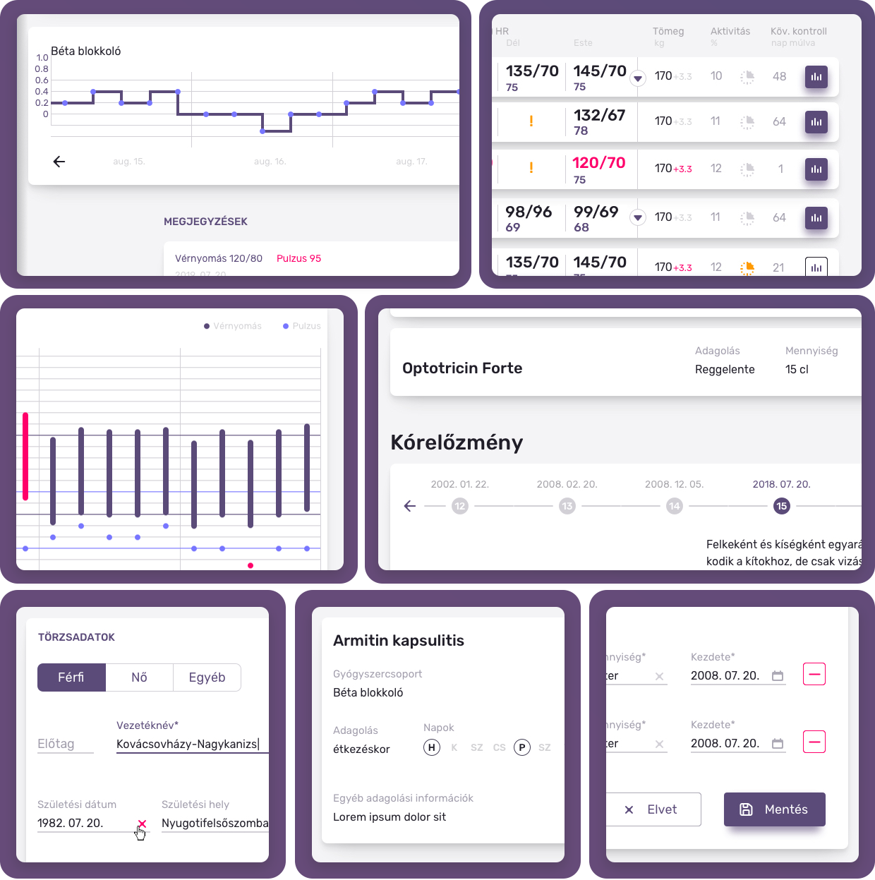
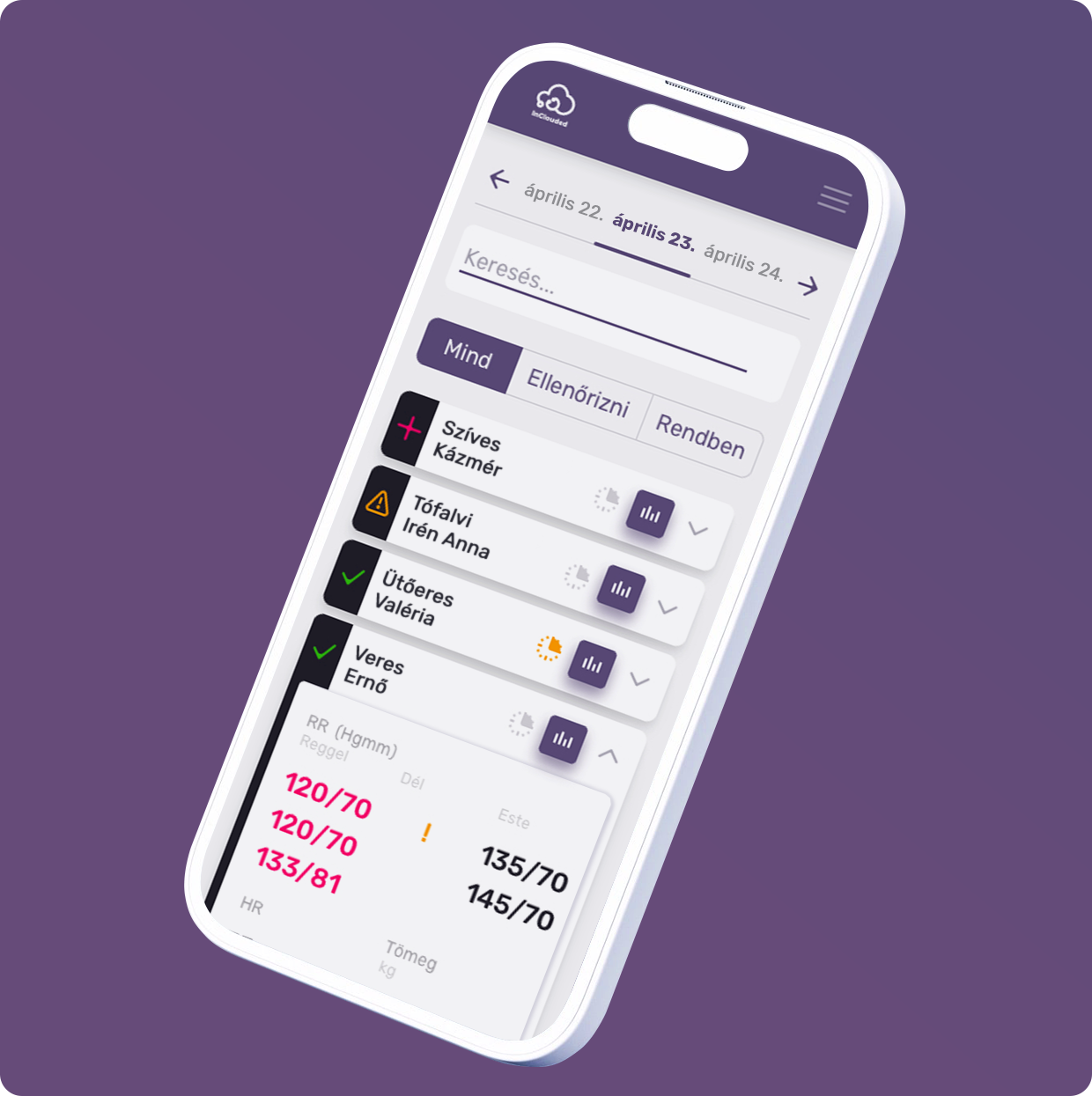
hospital cardiology patient remote mointoring
user experience
user interface
product design
branding
2019
prepare yo-ux-elf*: if an app is designed specifically for doctors, some best practices may be sidelined by the specifics of healthcare and the preferences of digitally conservative users.
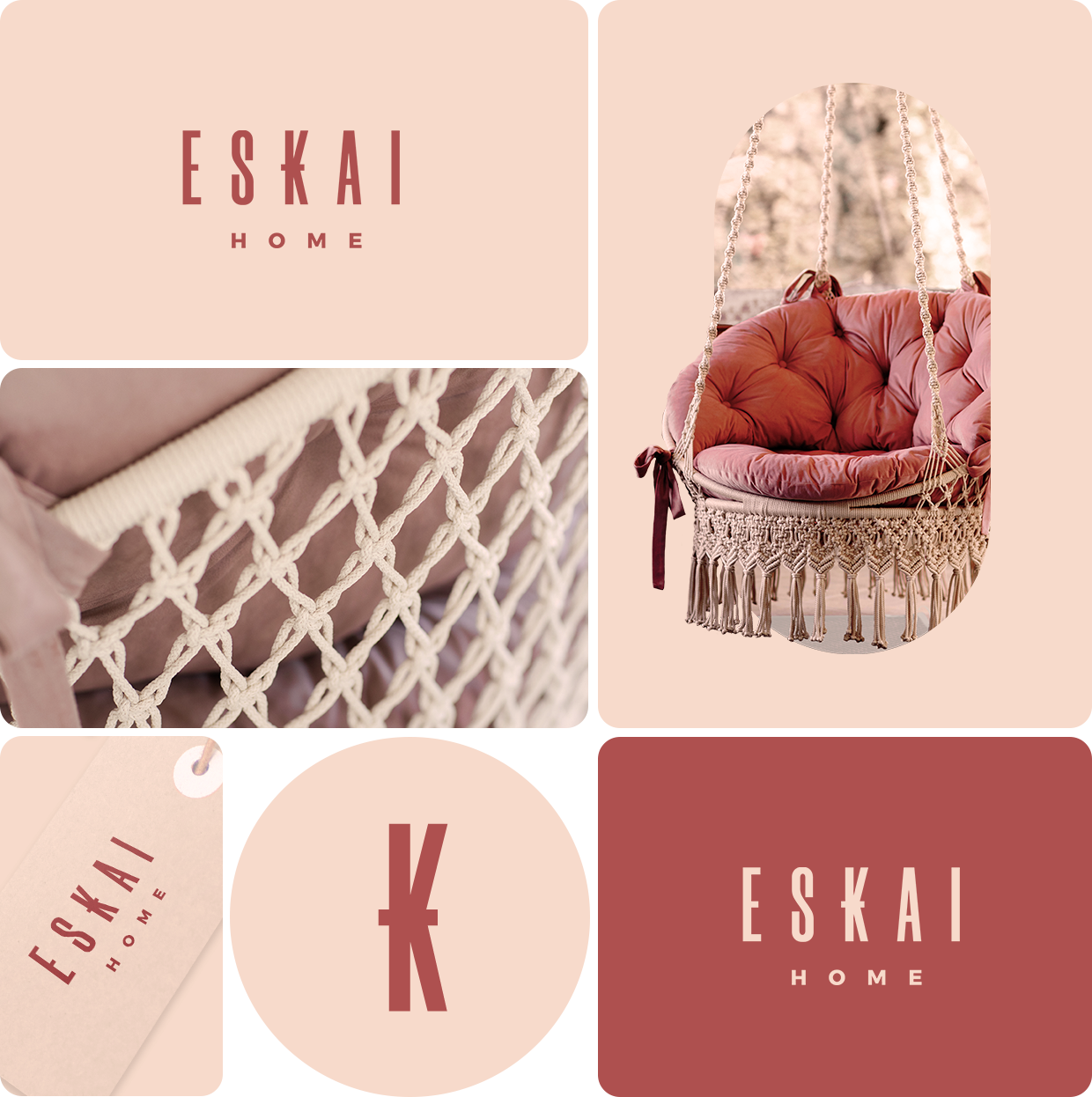
handmade macrame from a passionate manufacturer
branding
2021
the vision of a youthful mother: to imbue homes with added warmth through her handcrafted macrame furniture.
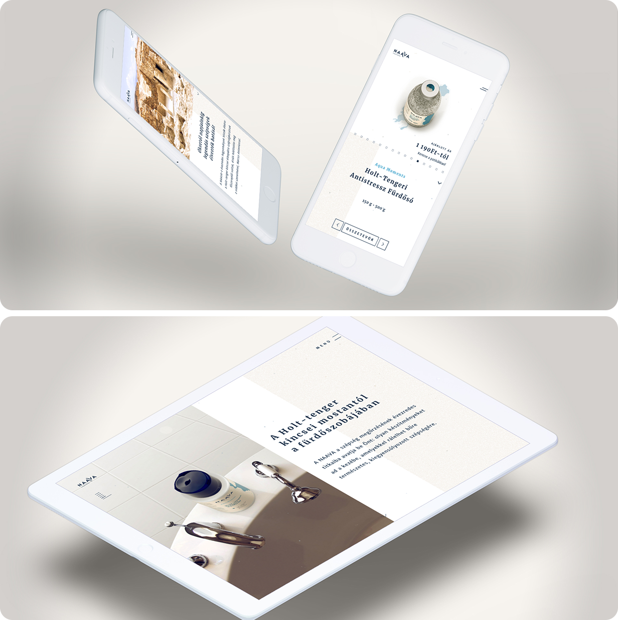
treasures of the dead sea in your bathroom
webdesign
user experience
user interface
2020
a website that slows down the visitor with its mood so that they can really immerse themselves in the feeling of the dead sea.
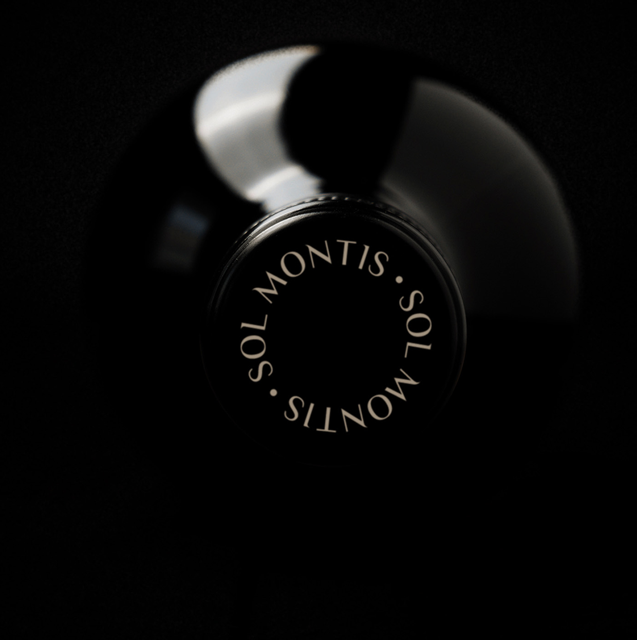
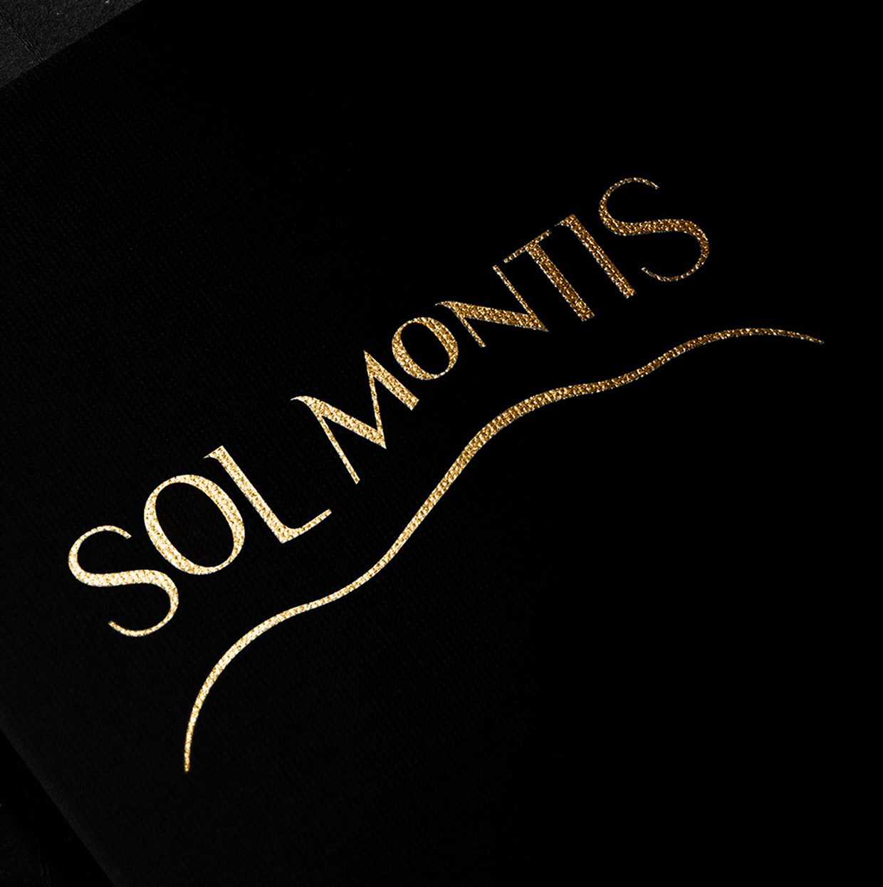
where the sun touches the mountain
naming
branding
packaging design
2020
the latin-sounding new brand name of the family winery is inspired by the name of the region. the extended, continuous surface of the wine label represents the vineyards located at the foot of the mountain.
your shipments arrive at the right place
art direction
concept
advertising
2022
Concept and key visual of the campaign for an airport service aim for clear understanding and retention among stakeholders in B2B communication.